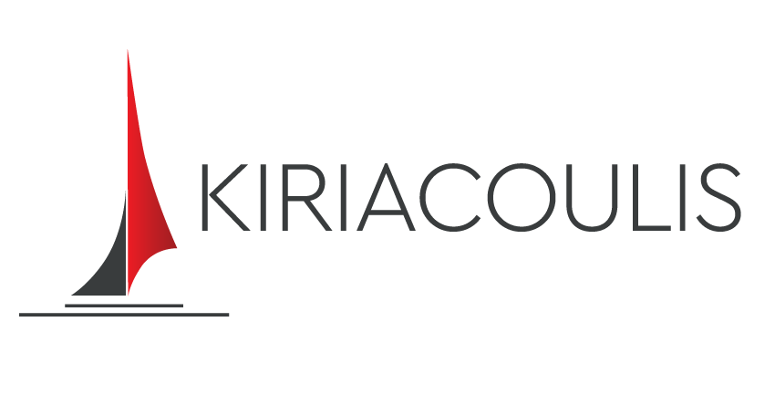
After more than more than 40 years of continuous presence in the global sailing industry, Kyriakoulis MKN SA renews her logo. It is a renewal that combines the Its rich heritage with a dynamic, modern visual identity, in complete harmony with the new era in which it enters, under the new administration and with the support of the new shareholders.
From its first steps to date, the company has built a name-symbol of credibility, know-how and innovation, with presence in many countries and ports. Its historical logo has been a reference point for four decades. Today, the time comes for a new visual footprint, without altering the identity that made it what it is.
“Our name remains. The substance remains. The new logo retains its basic features, while acquiring a cleaner, fresh and modern character. It is a natural evolution that reflects the energy and direction of the new era we are going through, ”says Mr. George Koutsos, the company’s chief executive.
The transition to the new identity will gradually take place at all contact points of the company, with the aim of fully integrating it in the coming months.
“This renewal is not just aesthetic. It is a statement of intentions. We move forward with confidence, without forgetting what the company is and where it started. The refurbished corporate identity is simply the expression of what the company has achieved over the years, and especially the operational potential we seek for the future, and our ability to evolve, innovate and adapt to a market that is constantly changing. “.

The new logo has already been presented internally to the company’s employees, who are the heart of every strategy and change.
